Model Performance
How the TNG Elo model’s pregame predictions have actually held up, game by game and season by season, since 2004. TNG went live in 2022; those four seasons are highlighted against the full 2004–2025 historical backdrop.
Full-Season Pick Accuracy by Year
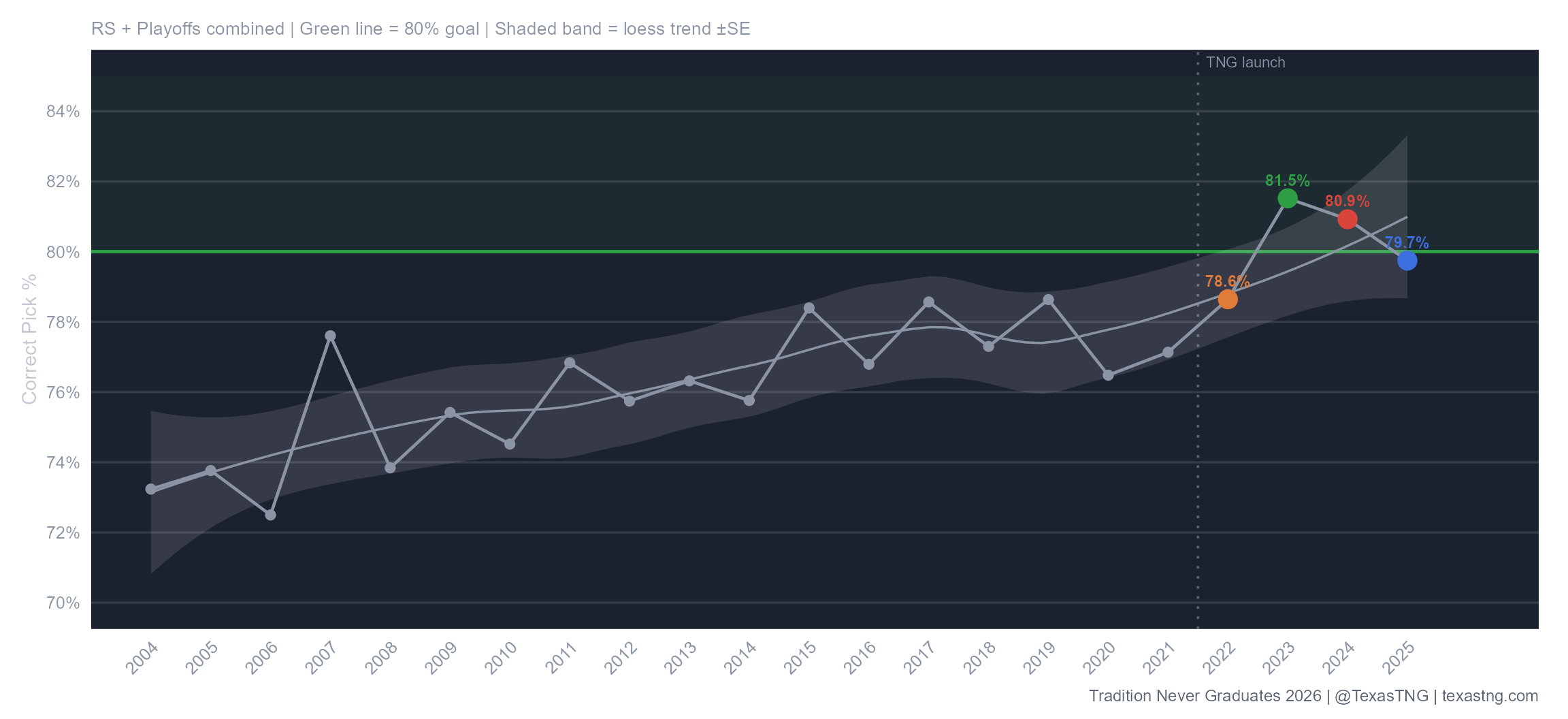
The one metric we really tried to optimize the model to handle the best was overall season pick accuracy. Our stated goal has always been to hit on 80% or better of the model’s projected winners in a given season. We topped that mark in 2023 and 2024 and fell just short in 2022 and 2025. Taking all four “live” TNG years together, we are at 80.2%.
You can see the slow build from the initialization of the model in the early years through 2021, before we started adjusting starting Elos each offseason, and you can see that the model may have peaked just shy of about 78% on its own. Once we started adjusting in the offseason for returning players, players lost, trends, etc. you can see that we were able to bring the model to a new level which is still potentially on the rise. The better initial starting Elos we set, the better the model will perform. It’s a difficult call to decide how much to move each team’s Elo each offseason as a result of their roster turnover but, based on the results below, we’re doing a little better than letting the computer uniformly regress all of the teams on its own and we’ll take that.
Are we slightly concerned with the drop from ’23 to ’24 and again from ’24 to ’25? Maybe just a little, but it’s worth recognizing that ’23 may have been the real outlier, while the last two years may have been more along a natural trend.
Pick Accuracy by Week
How often the model’s favorite actually won, week by week across the season, compared to every pre-TNG season back to 2004.
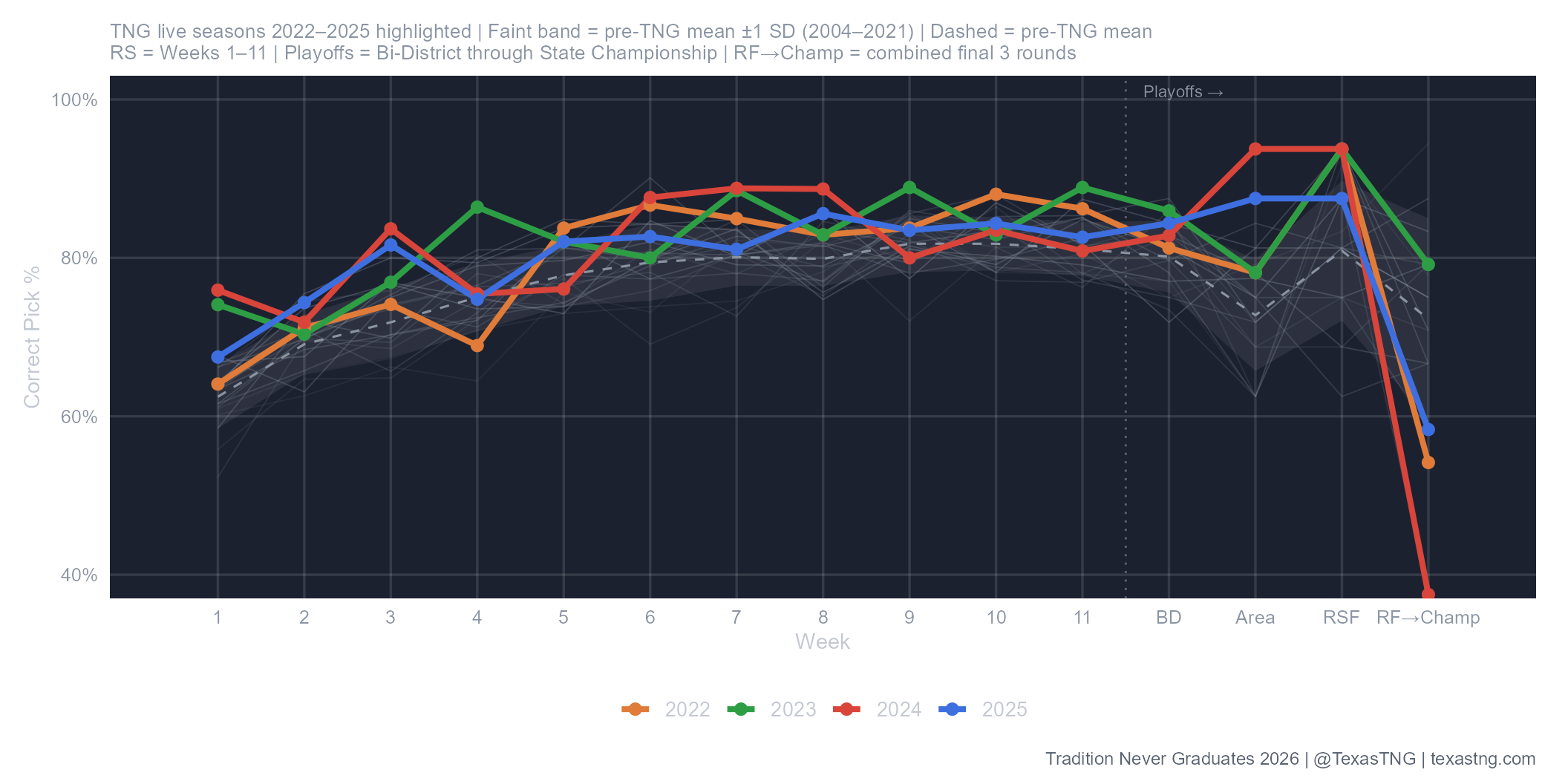
In this section we’ve got two charts to evaluate our pick accuracy by week. Above, we looked at season-long trends, but what does the model accuracy look like as the season unfolds?
The gray band in the background represents the 2004-2021 data spread, while the colored lines represent each of the “live” seasons individually to show how the results have shifted, largely, along the upper bound of the standard deviation of the 2004-2021 data. That’s great news because its again another indicator that our offseason work is helping.
What interesting in this first chart is the great Area performance in ’24 and ’25 followed by the sudden accuracy cliff after the Regional Semifinals (RSF below). What’s going on there? Part of the story is in the gray band behind the lines at the end; notice how it expands greatly, reflecting the wide spread of results in the latter rounds of the playoffs when teams are much more evenly matched.
Pick Accuracy Surplus by Week
Actual pick accuracy minus what the model’s own pregame win probabilities predicted; positive means the model beat its own odds that week.
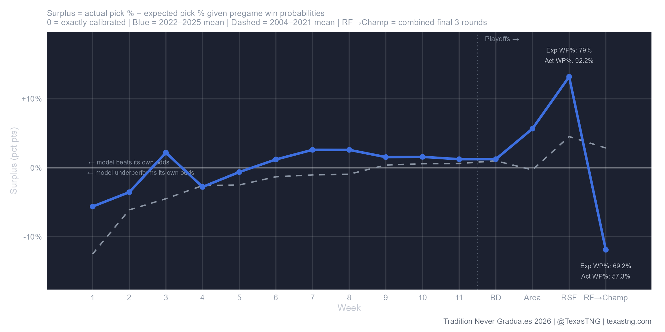
To further investigate the weekly pick accuracy, we need to look at how the model did relative to how it should have done. Some weeks you get a set of games that happen to be really easy; lots of 20+ point favorites and far less tight games, for example. We see that often, as well as the opposite; a really hard week with lots of toss-ups (i.e. late playoff rounds). In this next chart, we examine the surplus or deficit in terms of pick percentage each week through the season. Whether it was an easy week or a hard week, the model should generally hover around the 0% midline in this chart, and we can see that it pretty well does just that.
The solid line represents the last four years of picks, while the dotted line is again the 2004-2021 range of data. We see the dramatic spike in the third round (RSF) and then the line dives hard for the fourth round through state. However, if we look at the annotations we can see that while, yes, the model did worse than expected in the latter rounds, the difference was really between an expected win percentage of 69% vs those favorites winning 57% of the time. Not ideal, but also not a disaster. It’s also a pretty small dataset with only four years of late round playoff games; worth watching, but not alarming.
Annual Brier Score
Brier score measures calibration, not just win/loss accuracy. 0 is perfect, 0.25 is no better than a coin flip, and lower is better.
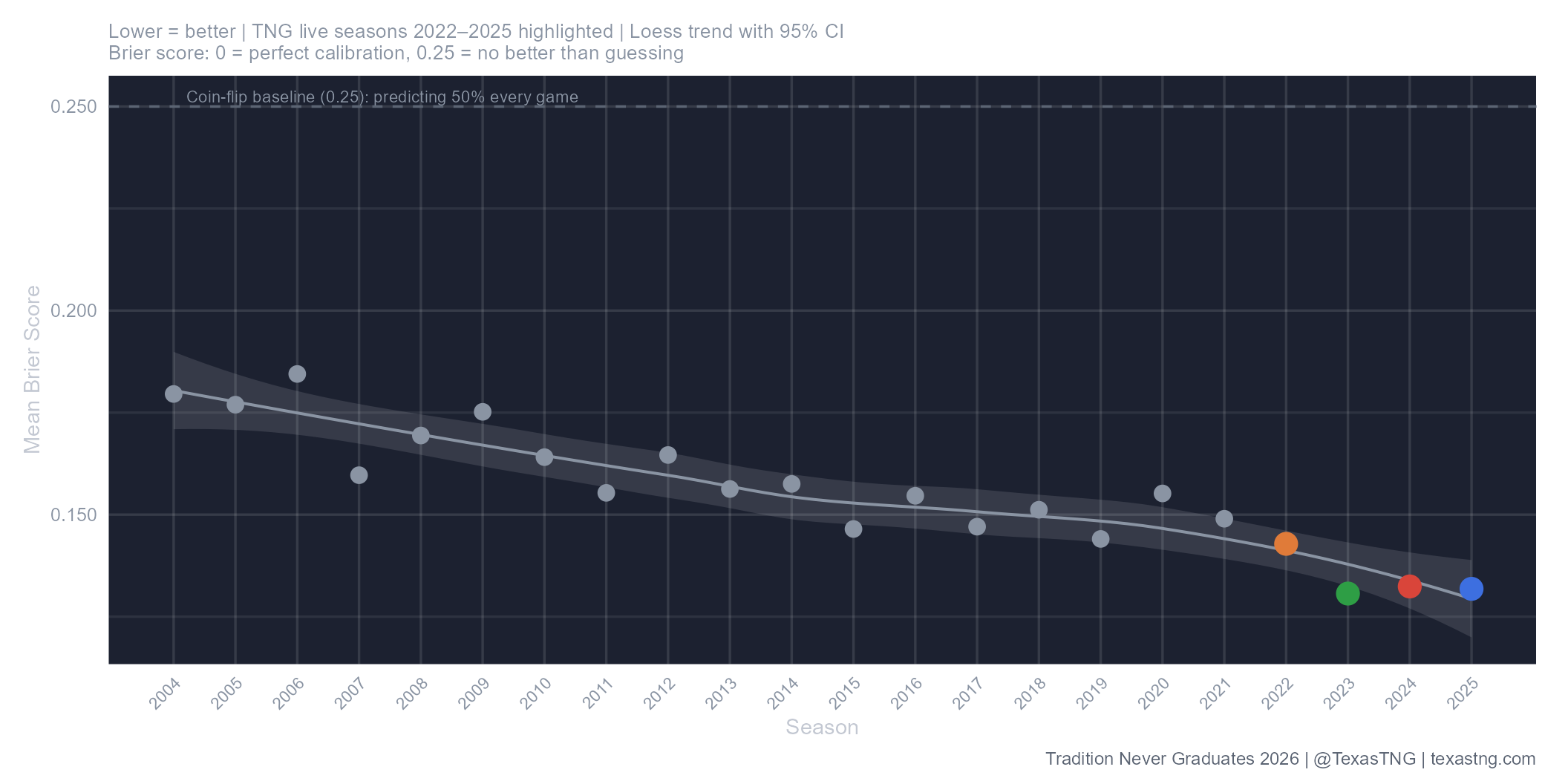
Another way to evaluate predictive modeling is to look at the Brier score. Brier score is essentially a measure of the accuracy of our projections. If our model says Team A has a 70% chance to win over Team B and Team A wins, that yields a Brier score of 0.09. If Team A were to lose however, that would yield a Brier score of 0.49. If our model gave every team in every game a 50/50 chance of winning, then our Brier score would be 0.25 for the season. So, effectively, Brier score rewards bold but correct picks, while heavily punishing overconfident and wrong picks.
In the Brier score chart we can see the same general gradual improvement over time and eventual flattening as we saw in the graph above, followed by a slope change once we started making our offseason tweaks to starting Elos. Our Brier scores pushing toward the .125 range is another excellent indicator that the model is doing well.
Margin Calibration
Each dot is every game at that projected margin, averaged. The orange dashed line marks perfect calibration.
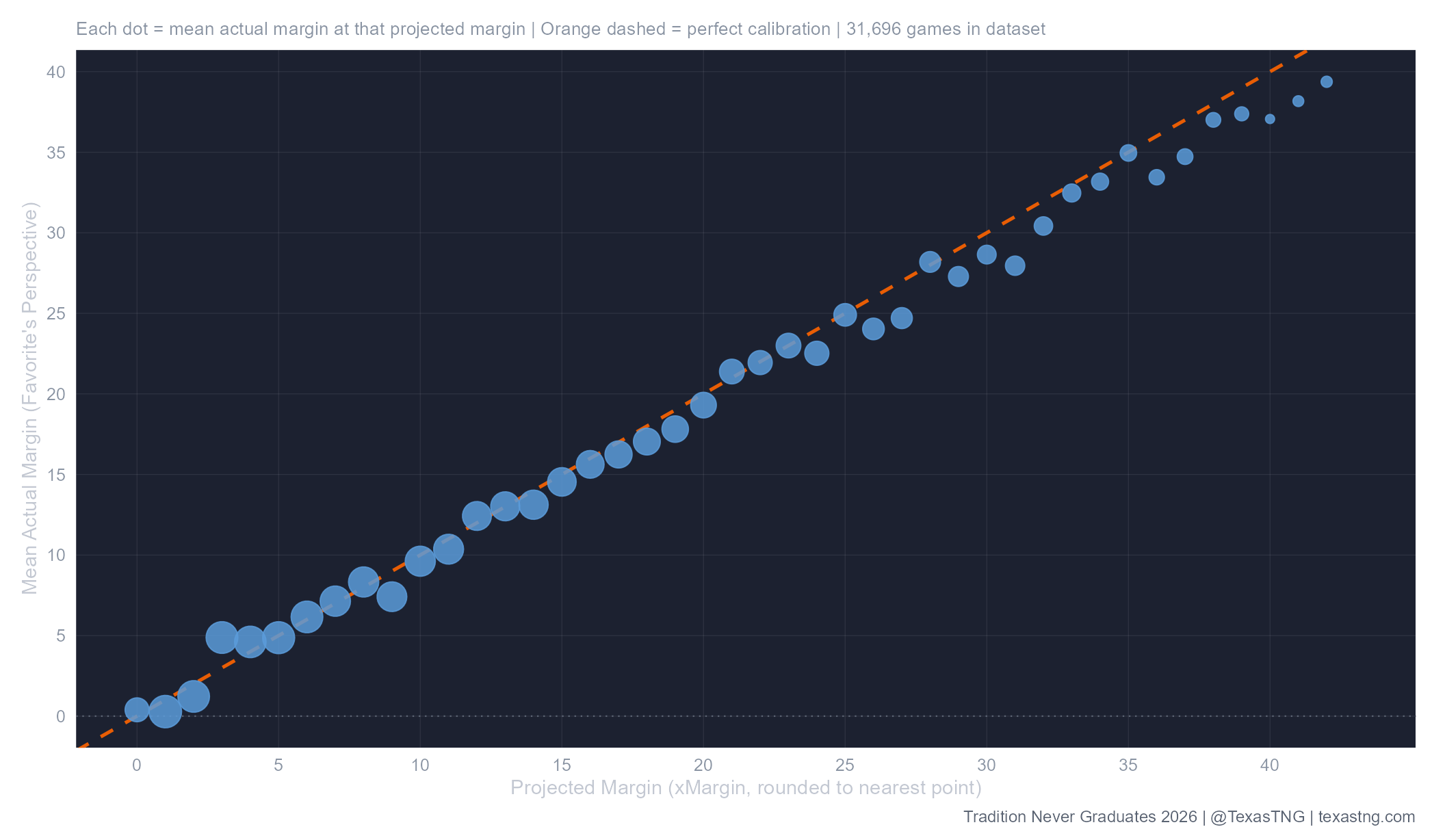
In a well-tuned Elo system for football, a 25-point Elo gap represents 1 point on the field; that’s how we get our game-by-game projected margins each week. If our model says that two teams separated by 250 Elo points should result in a 10 point margin, does that actually happen? On average across the dataset, this chart says that we’re doing pretty well. Everything along the dashed line in the chart below would represent an ideally calibrated model and, as you can see, the data lines up pretty nicely. Once we get past games projected to be about 24+ point margins you can see that the actuals start to struggle to reach the projected margins, but that makes sense. Above four scores, the games are well in hand, so the exact spread matters less, but it is interesting to see the general trend continue to follow out to 40+ points.
Predicted vs. Actual Margin (2022–2025)
Every game since TNG went live, one point per game. The dashed line marks a perfect prediction.
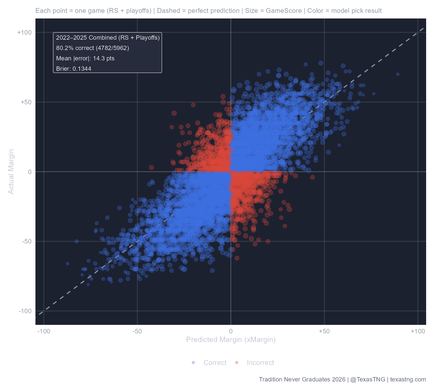
The previous chart is cool and makes us feel good, but this next one is closer to reality. Though, yes, on average over a huge dataset, the numbers converge as they should, a graph like the above can give a false impression of the game-to-game model accuracy. If the above held for every game, then you get into “Why play the games” territory, but we know better. There’s still plenty of unpredictability on any given night and that’s why we love the sport. This next graph encapsulates that pretty well.
What you see in this final chart is every single game of the last four seasons represented on one plot. Red dots are model L’s while the blue dots represent model W’s in terms of predicted winners winning (blue) or predicted winners losing (red). The dots’ positioning, however, tells the bigger story, which is what happened vs what was expected in terms of the margins.
Going left to right you’ll find the projected margin, and along the vertical axis you’ll find the actual final spread. The callout box in the top left summarizes the data. On average, our projected margins have a mean error of 14 points per game. That’s actually pretty good in the realm of football predictions, but clearly still shows that as good as any model can be, there’s still a game to be played in which just about anything can happen.